Making Pinterest inclusive for all levels of vision
Today we’re announcing updates across our apps and website for Pinners with disabilities. Now, all new UI components of Pinterest are more inclusive for Pinners who are blind and visually impaired. As a result, it’s much easier for you to browse, search and save ideas on Pinterest.
Our mission is to help you discover and do what you love, and we want everyone to be included in that mission. That’s why we partnered with Lighthouse for the Blind and Visually Impaired to better understand how we could make Pinterest more useful for people with different levels of vision.
After talking with Pinners and learning how Pinterest was (and wasn’t) working for them, we did an accessibility audit and created a list of areas to improve. Some of these include:
- Better screen reader support makes signing up, browsing and saving easier and more usable.
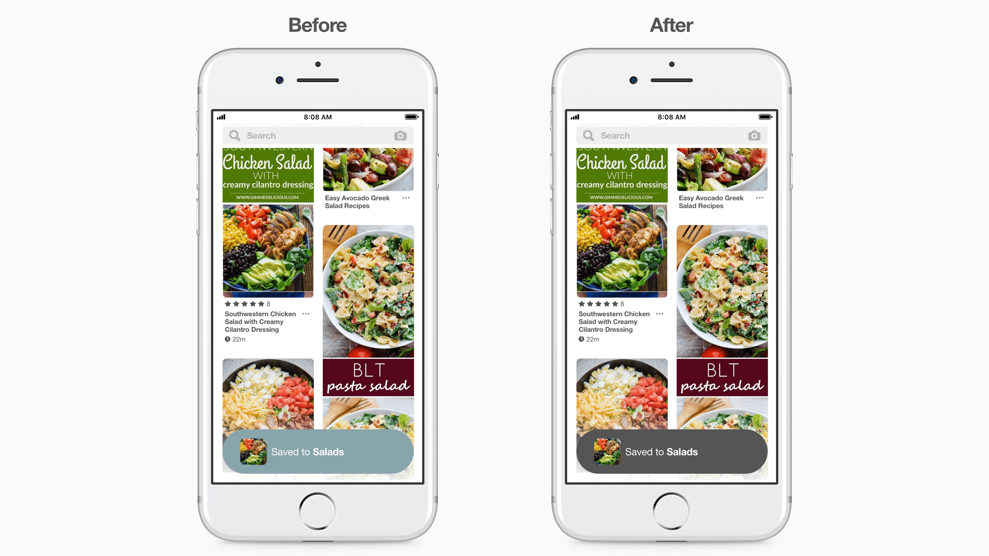
- Color contrast sensitivity improvements make our color palettes more readable and easier on the eyes. This is especially helpful for Pinners with sensitivities to bright colors and those who have low vision.
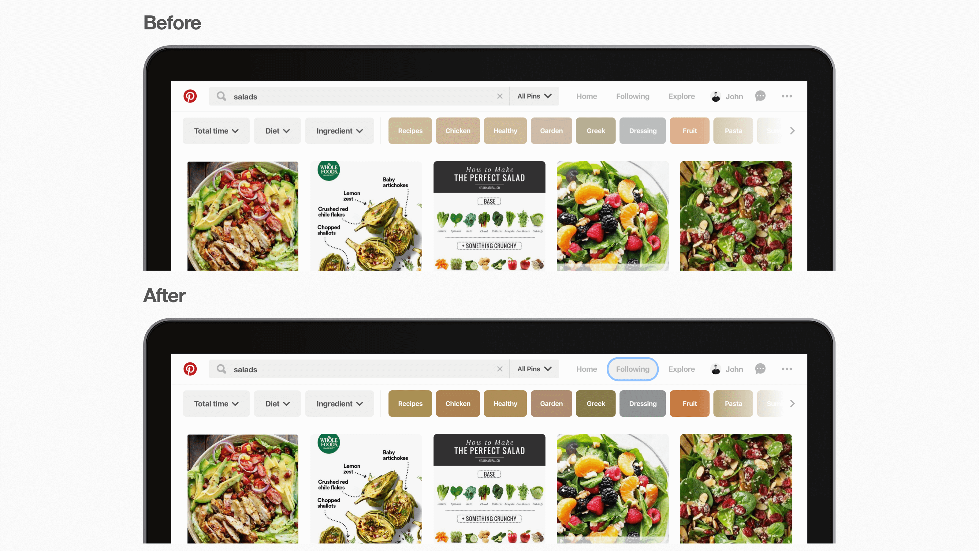
- Focus indicators help people with mobility or visual differences use a keyboard or another device to navigate to see which part of the site is in focus.
We also created accessibility best practices for engineers and designers, in addition to a new UI library with accessible components. As we develop and design Pinterest, accessibility checks are now in place to ensure we have clearly labeled icons and components for any new feature.
We’re continuing to make Pinterest more inclusive of everyone. We’ve made significant progress updating our iOS and web platforms to meet the majority of the accessibility standards, and we’re working on bringing these changes to Android soon.